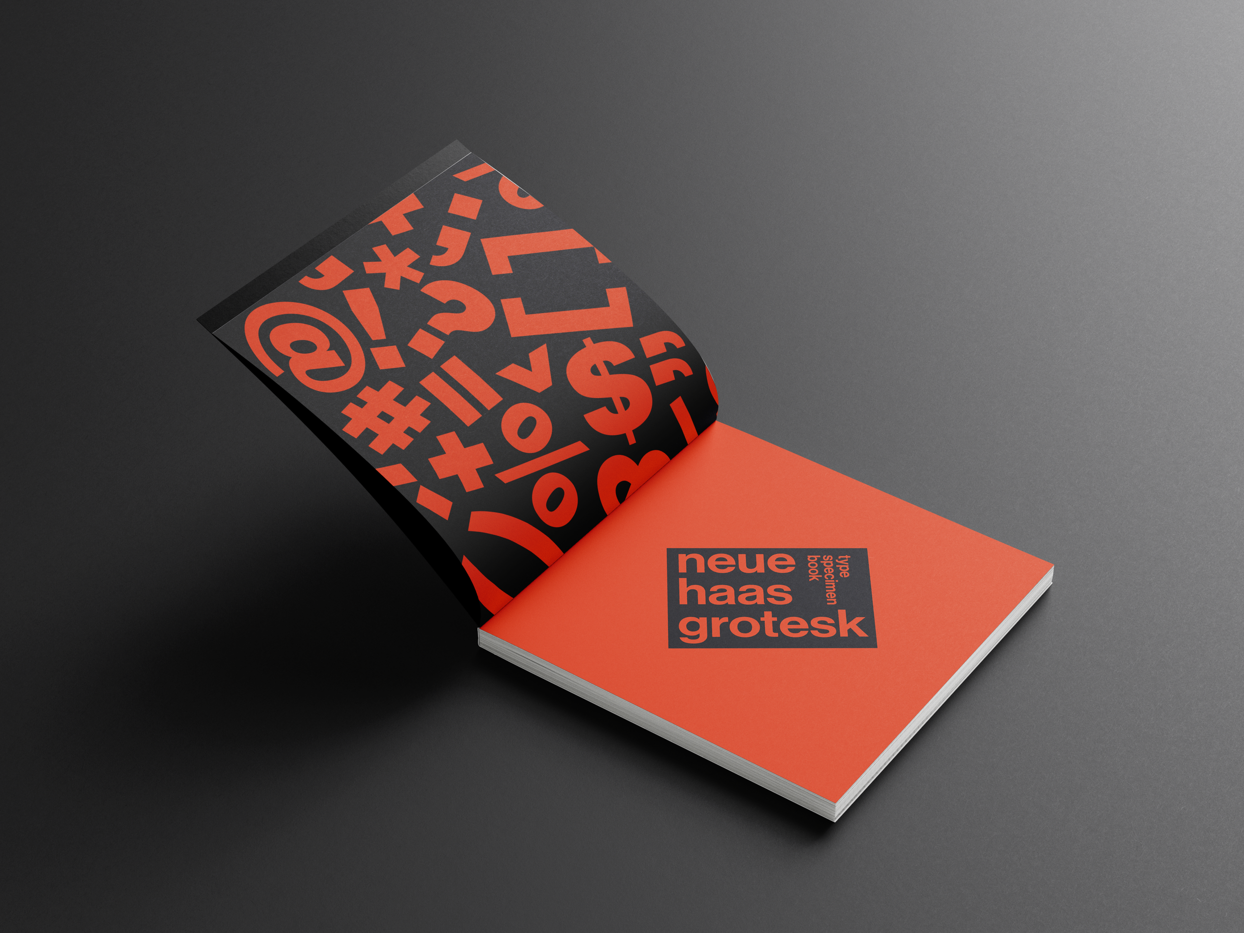
Type Specimen: Neue Haas Grotesk
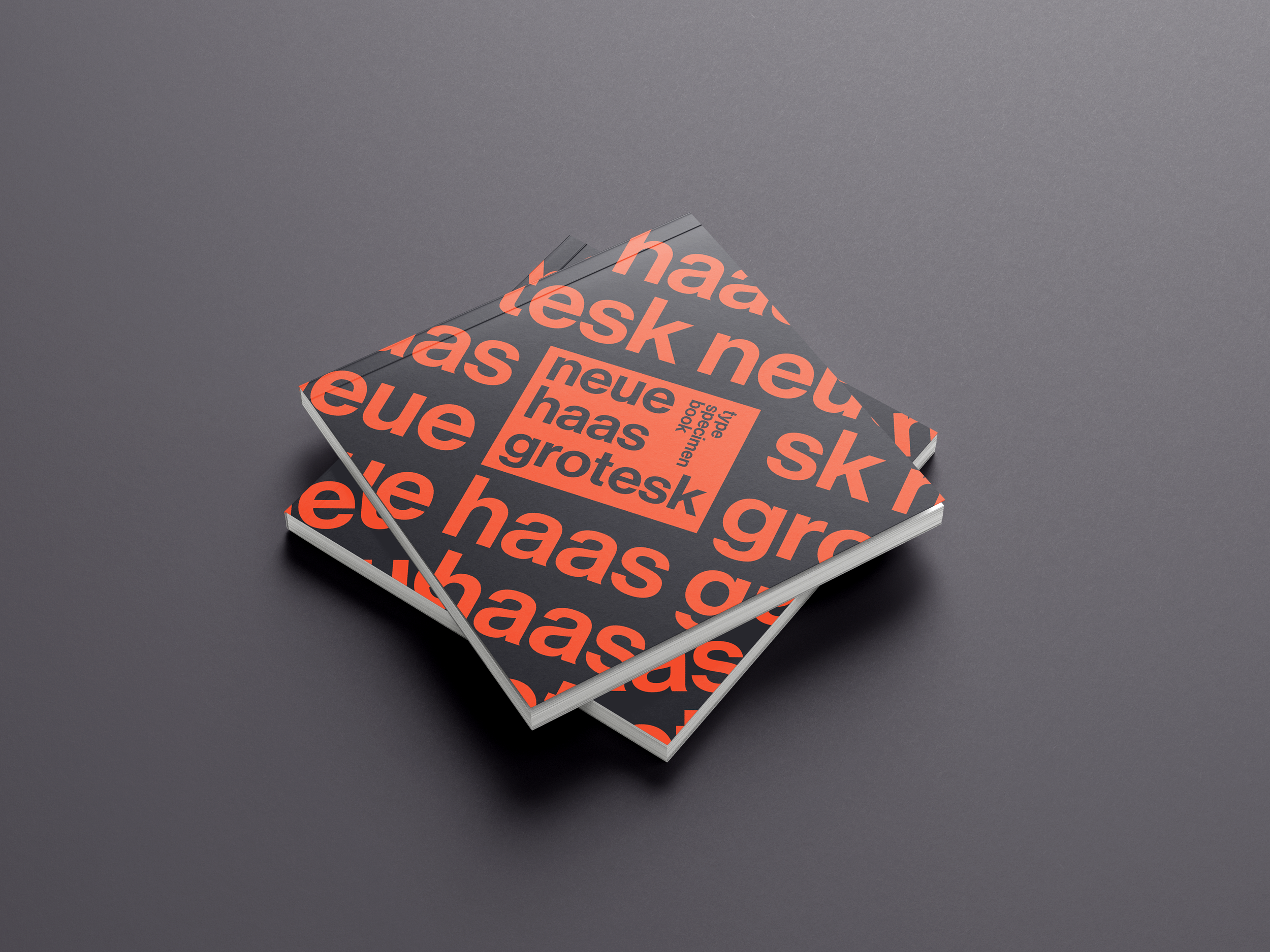
A book that explores the history, structure, and visual character of Neue Haas Grotesk.
Project Type: Editorial & Print
Timeline: 2 months
Purpose: To inform on the history of a typeface
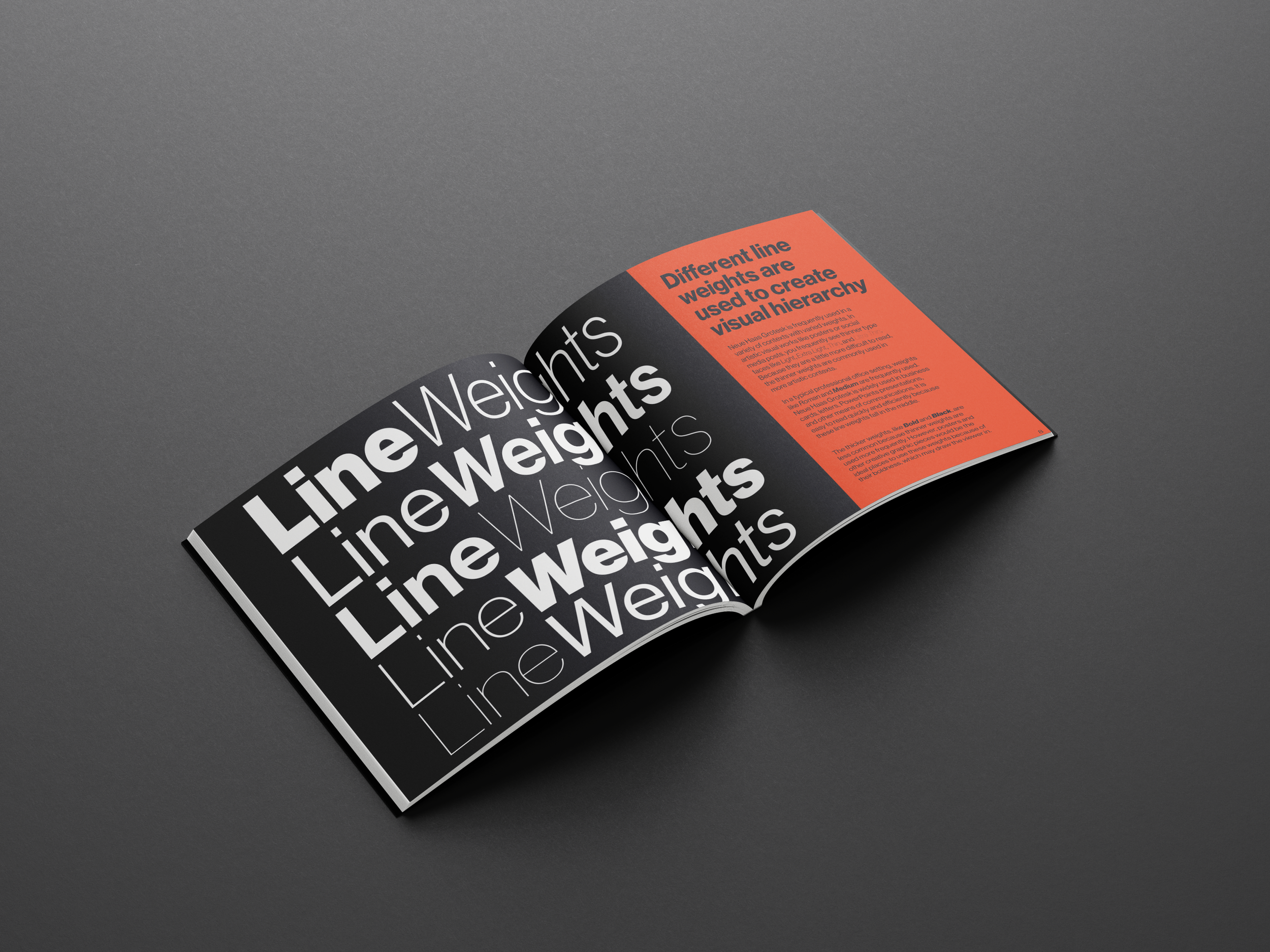
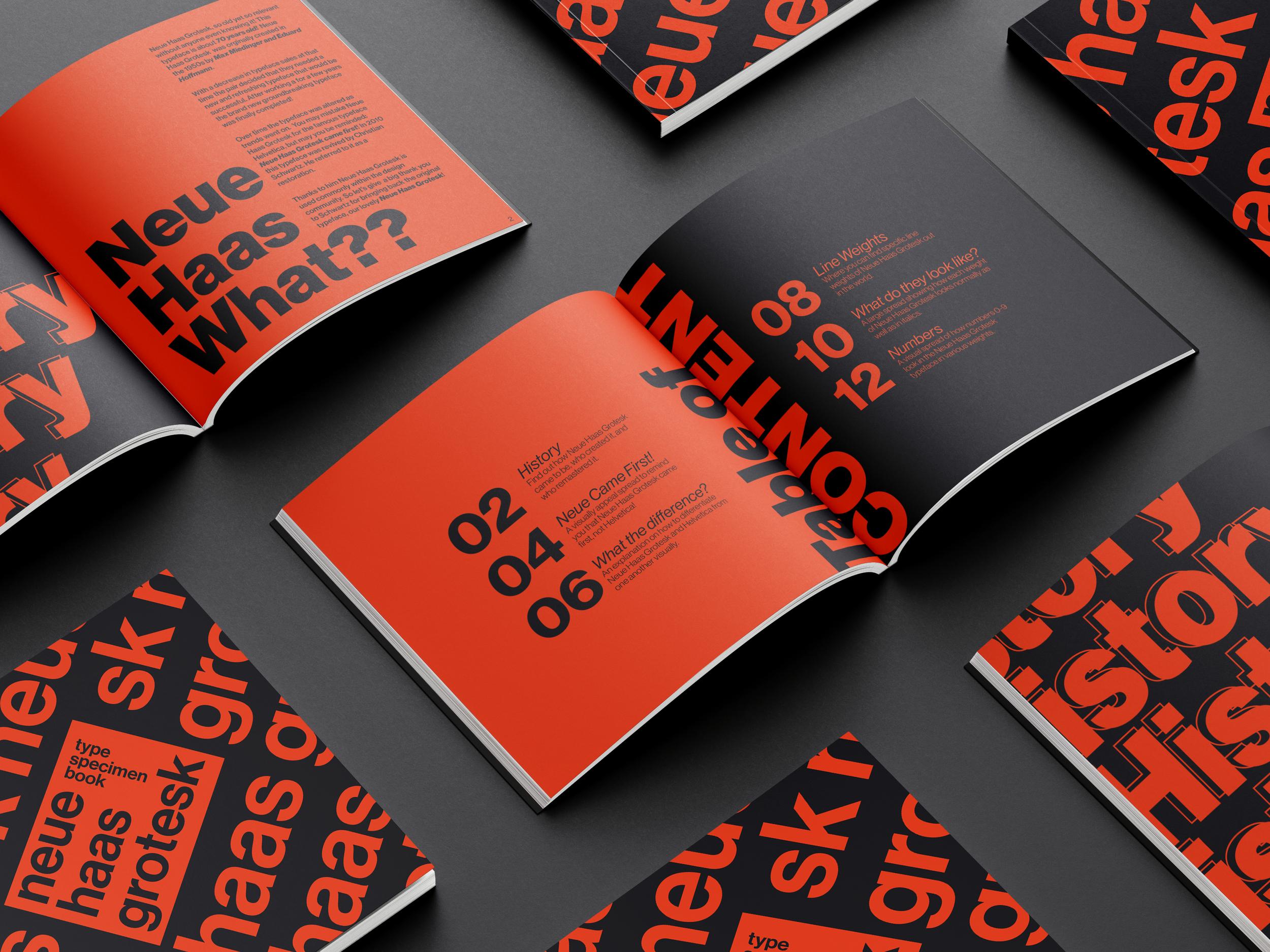
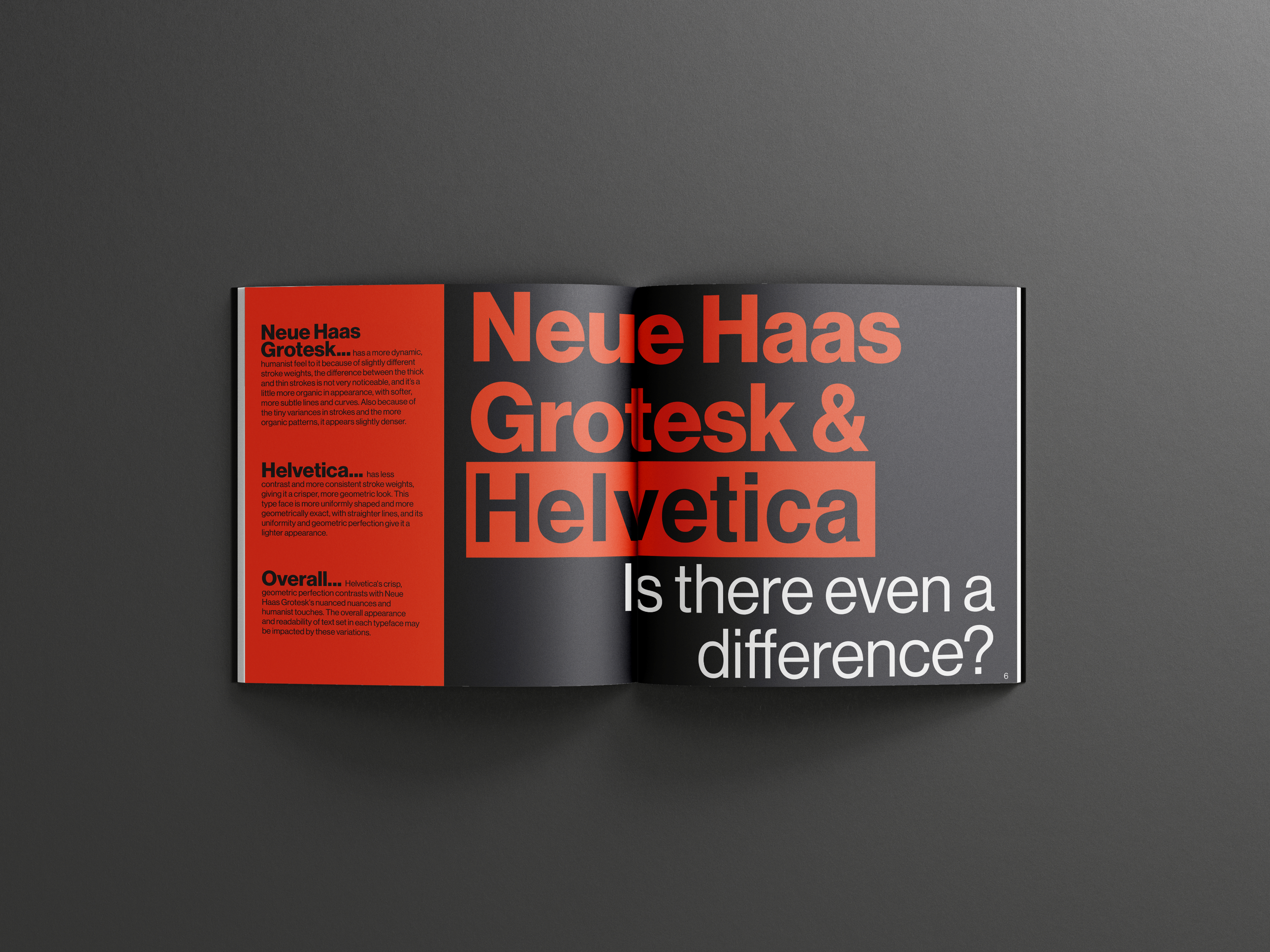
I was tasked with creating a visually engaging book that showcased a single typeface. I chose Neue Haas Grotesk, the precursor to the iconic Helvetica, as I wanted to explore the history and impact of this influential font. My primary goal was to ensure that the book was visually captivating, avoiding any dull or monotonous layouts that could disengage the viewer. To keep the design dynamic, I experimented with different line weights, formats, and layouts. I played with spacing and composition to create variety while maintaining a cohesive design throughout.