Soar Sky Publishers
A branding identity that balances simplicity with elegance, resonating with both authors and readers alike.
Project Type: Branding
Tools Used: Illustrator
Duration: 1 Month
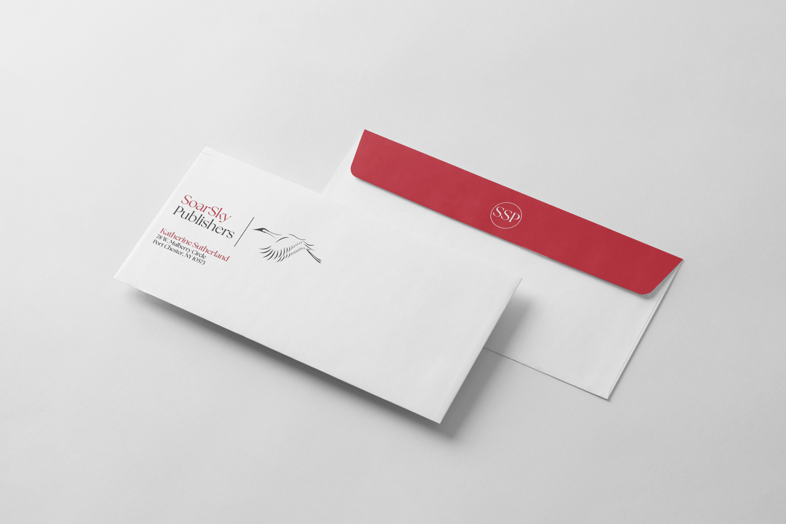
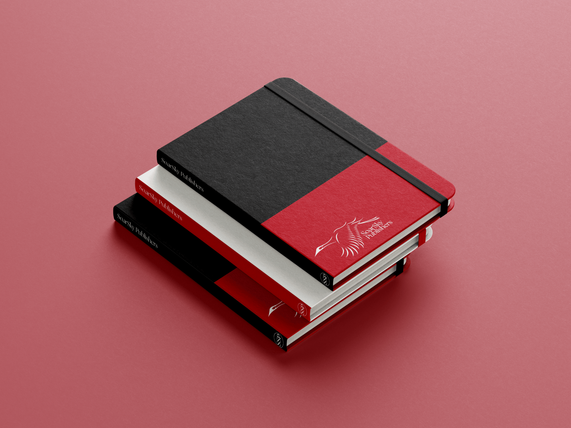
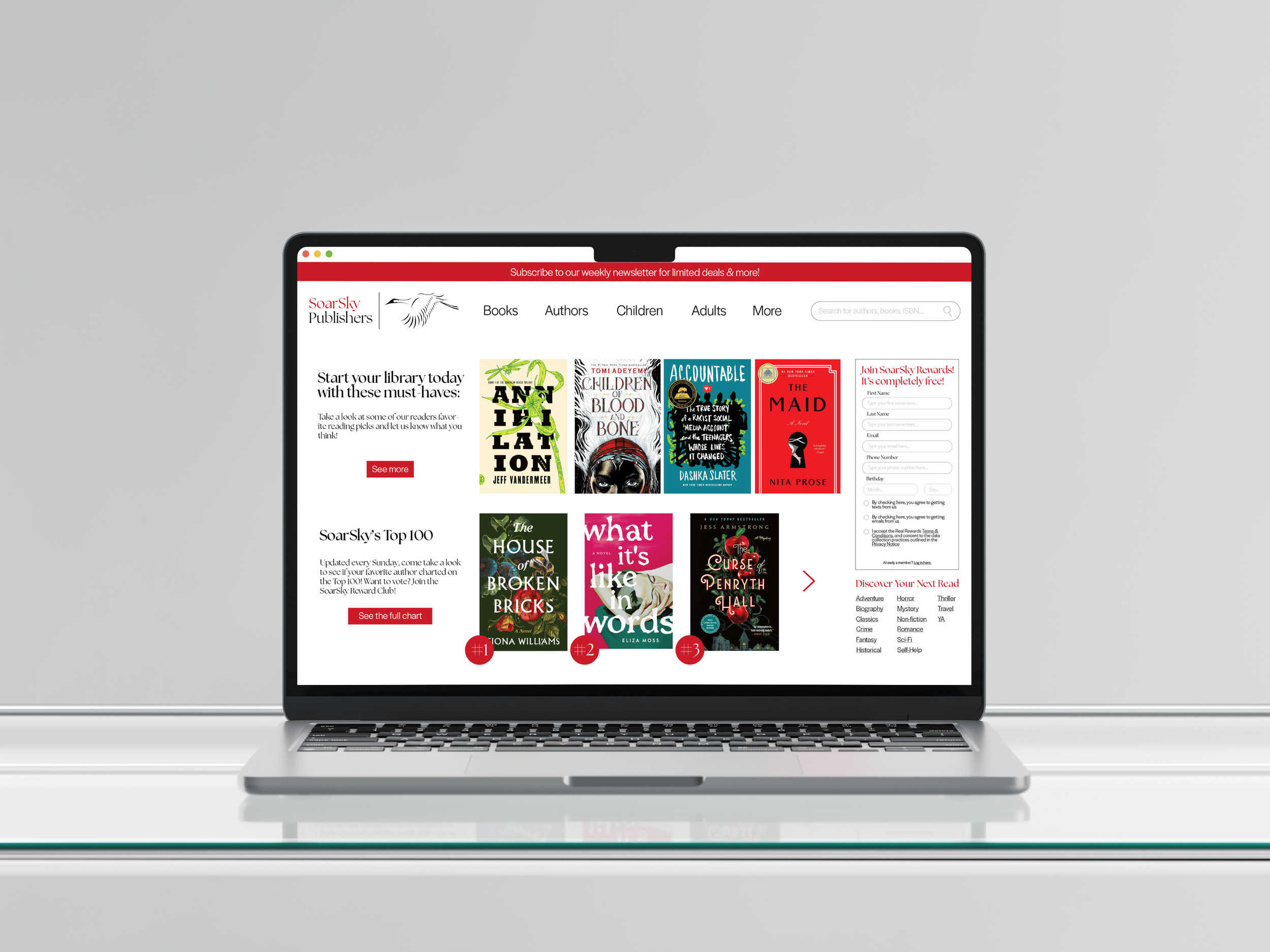
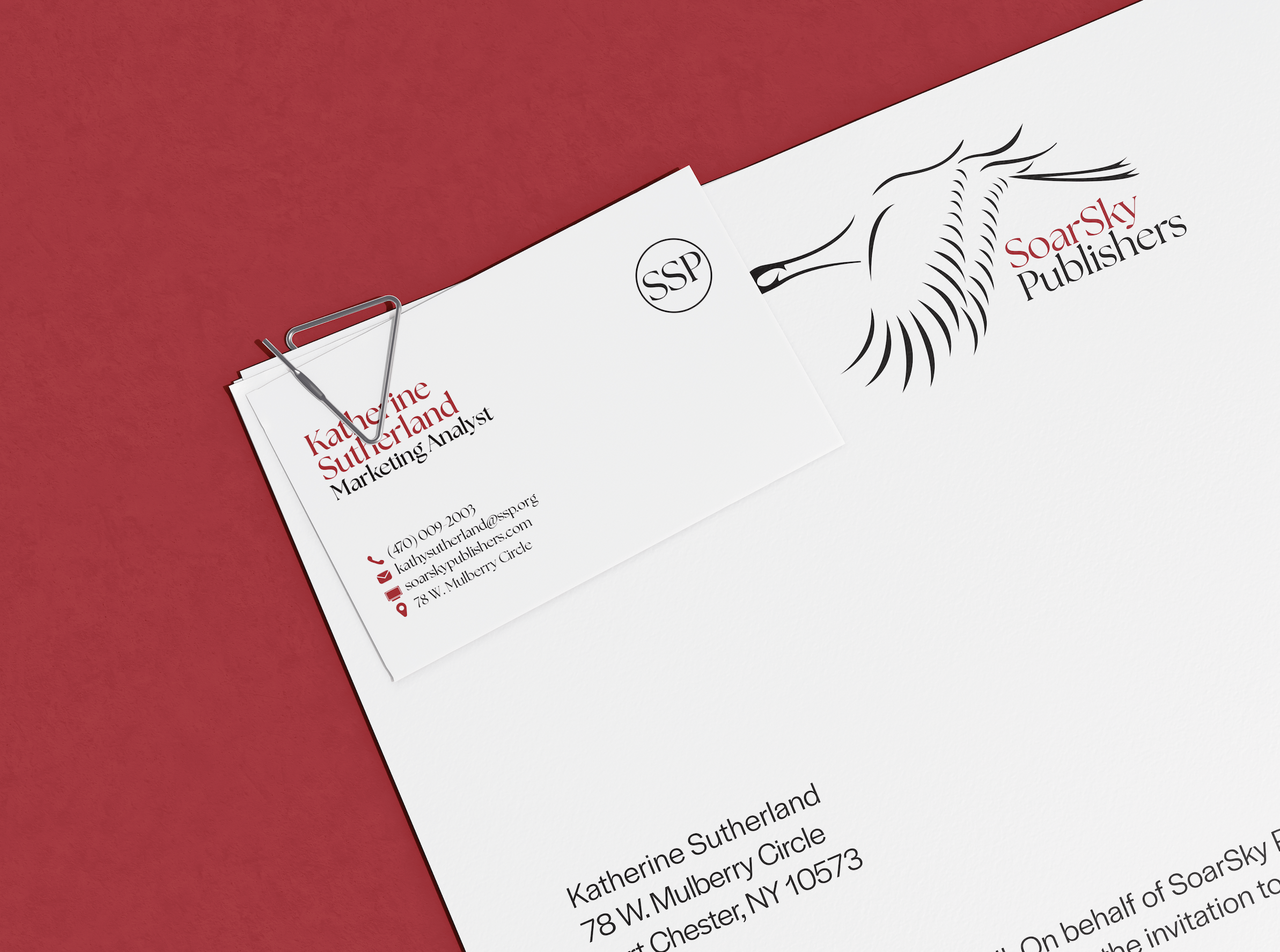
For the creation of SoarSky Publishers, a fictional book publishing company, I designed an entire branding system from scratch, including logo, stationery, and additional brand materials. Inspired by the crane—a symbol of strength, grace, and longevity—I wanted to develop a logo that was both sophisticated and memorable while standing apart from typical publishing company identities.
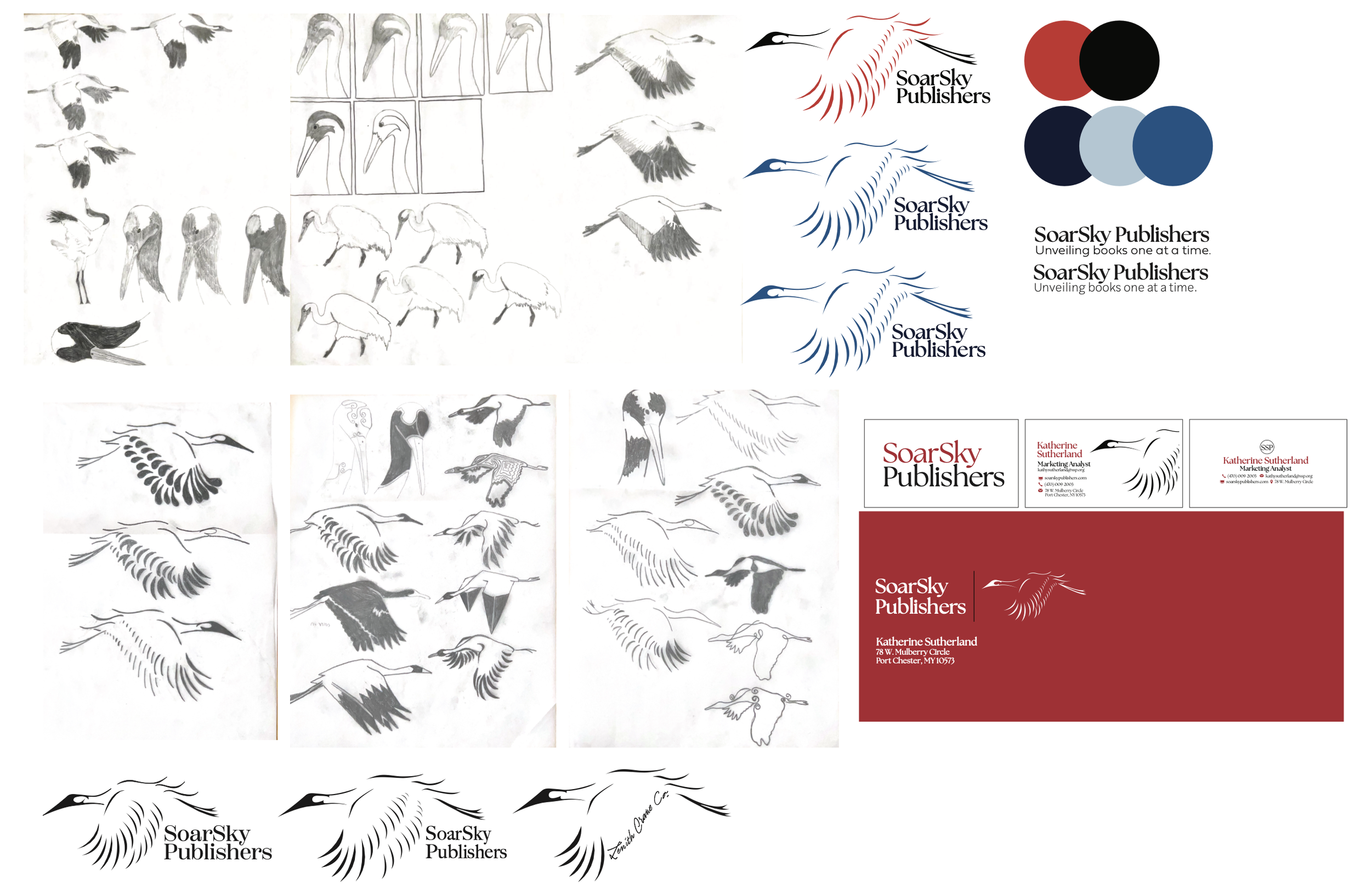
After studying various crane poses, I chose one that captured the essence of elegance and motion, which became the foundation for the logo. I then experimented with multiple styles and digital iterations before refining the design in Illustrator. Selecting the right typeface and color palette was a process of trial and error, ensuring that each element resonated with the professional, high-end feel I aimed to achieve.